Flourish
APP DEVELOPMENT PROJECT
I was hired to design the UX, UI, and branding for Flourish.
The app focuses on domestic violence prevention,
education, and information.

ABOUT THE PROJECT
Flourish is a free App focused on domestic violence prevention, education, and information. The app contains information and resources for people who are currently in, or have left, abusive relationships.
MY ROLES & RESPONSIBILITIES
UX & UI Lead and Branding.
WHAT I USED
- Flowchart
- Wireframe
- Interviews
- Prototype
- User Testings
THE TEAM
- Me as a UX & UI Lead and Branding.
- A Project Manager that was also the content writer.
- A full-stack developer.
GOALS
To create an App that:
- Does not look like a safety App unless closely examined
- Uses simple vocabulary and is easy to navigate
- Integrates both the client’s safety checklist and resource maps
- Have a mandatory Stop Button to fully close the App
LENGTH OF THE PROJECT
November 2018 - March 2019
TOOLS
Adobe Photoshop
Adobe Illustrator
Adobe Xd
WORK TIMELINE
INTERVIEW & PERSONAS
Why were personas necessary for Flourish?
Intimate Partner Violence (IPV) is a deeply sensitive and personal matter necessitating a thoughtful and empathetic approach in App design and communication.
Goal: Understanding the specific users and the considerations associated with creating a UX for victims of IPV.
Challenge: The stigma associated with seeking help for domestic violence is an ongoing challenge. This meant I was only able to get user anonymous feedback and information through my client acting as an intermediary.
Solution: Personas helped identify key demographics, behaviours, goals, and pain points. This allowed me to prioritize quicker access to the most essential information and services. Personas allowed me to humanize the design process and keep the user at the centre of my decision-making.
INFORMATION ARCHITECTURE
PAPER PROTOTYPING
I needed to visualize and test the layout, structure, and user interactions ensure they were easy and intuitive.
Goal: To create a user-centric flow that facilitates quick and safe access specific services and information.
Challenge: The App needed to include a wide range of services, some of which would only be relevant to a very narrow user base.
Solution: Paper prototyping combined with a feedback workshop allowed me to quickly modify the App structure and create a effective hierarchy of information. I highlighted the most essential services to avoid cautious users abandoning the App with limited time to safely access it.


FLOWCHART
It was essential to create a clear structure for the stakeholders to approve and roadmap for the developer to follow.
Goal: To build a central framework for how the App would be structured.
Challenge: Integrating the client’s existing safety checklist to direct users to a specific information package based on the users’ responses.
Solution: The checklist was refined and turned into simple YES or NO questions which were used to link users to specific information packages based on their responses.
With the Information Architecture defined, it was essential to confirm that navigation felt natural and that key information was quickly and easily accessed.
Goal: To visually outline the layout and structure of the App with interactive navigation to confirm effective navigation and resource accessibility.
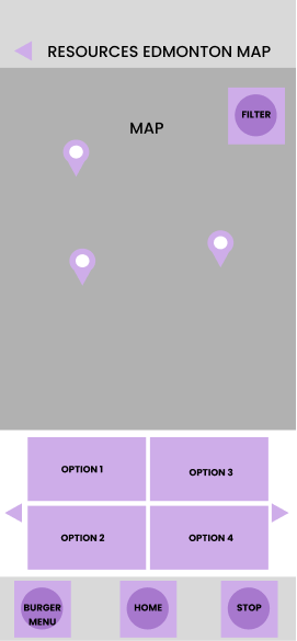
Challenge: Our client had a map they had previously developed listing locations where victims of IPV could receive assistance. The map had been created using Google Maps and needed to be implemented within the Flourish App. Additionally the client also wanted to improve navigation of the map to be more user-centric.
Solution: A low-level wireframe created for user testing. Feedback allowed me to fine-tune the navigation of the map. Testing identified a common request was the walking distance towards the selected location and quick access to a walking route. I implemented these features along with an estimate of how long it would take to walk to the destination. Additionally I created a filtering menu to allow users to easily search for specific services relevant to their situation.
USABILITY TESTING


USER INTERFACE
With the UX ready we moved on to designing the final branding and UI.
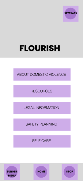
Goal: To have a clean interface that didn’t look like a safety app unless closely examined. It was a requirement that all pages of the App have a stop button to allow users to quickly close the App if their abuser was near.
Challenge: With so many different categories of information, it was essential to visually define each section of the App to facilitate easy wayfinding. I wanted to avoid users getting lost, or struggling to find information they had previously accessed.
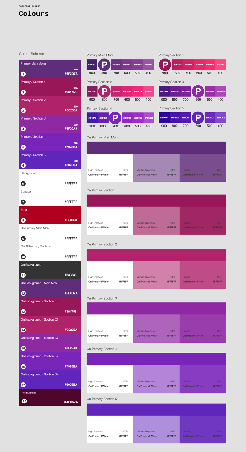
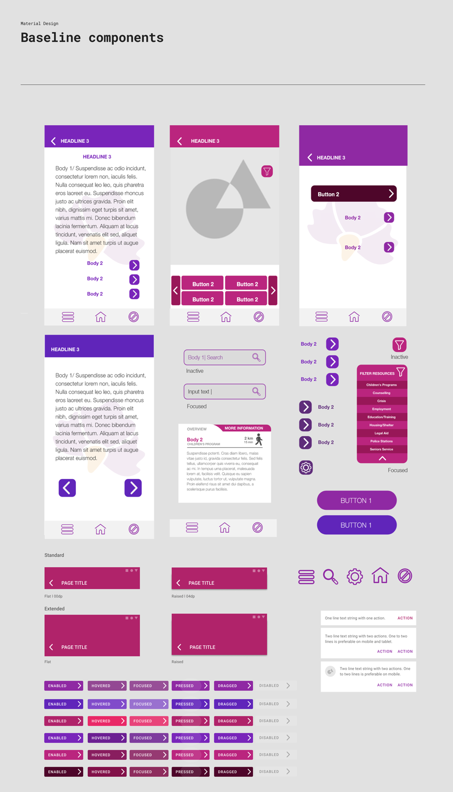
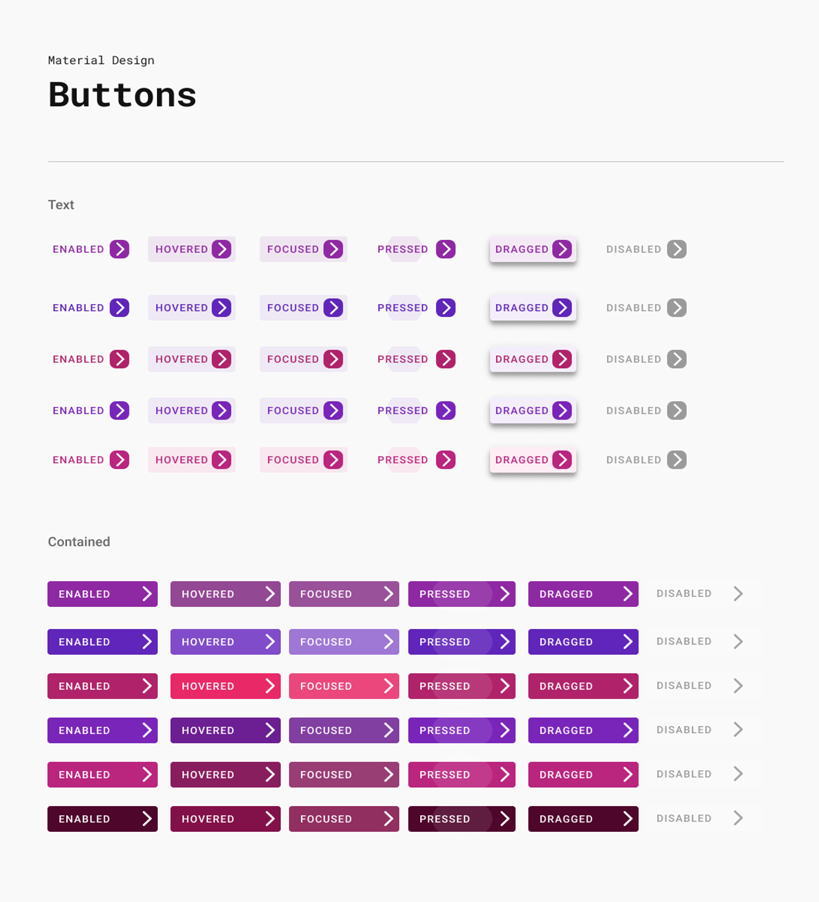
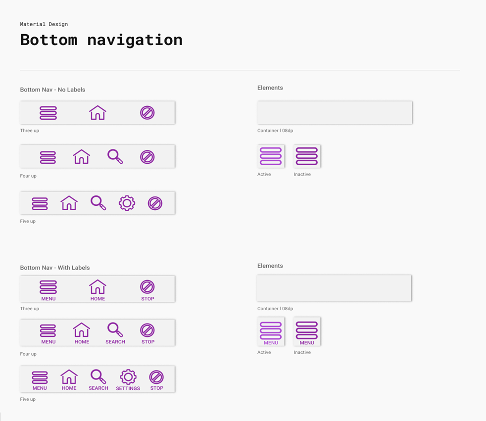
Solution: I used specific colours to identify sections. The baseline components such as header, buttons, highlight texts, are all be the same primary colour of the section. This creates a visual landmark and assist in wayfinding.
UI STYLE GUIDE
BRANDING
As a brand, Flourish was intended to feel safe and secure. The client had decided on a name before starting the project.
Faith, Love, Optimism, Understanding, Respect, Independence, Support, and Hope
- FLOURISH -
LOGO
ELEMENTS MEANING

REFLECTION
The Edmonton John Howard Society internal team provided great feedback throughout the project. Furthermore, they assisted in finding people who had suffered Intimate Partner Violence willing to participate in interviews and user testing.
This project offered an exciting opportunity to listen closely, implement research and tailor my design to a narrow user group. Although it was a challenge to deal with real stories of abuse, it was also deeply rewarding creating something to help prevent future suffering.
I tackled the challenges as well as the discussions we had as a team with enthusiasm and positivity. It was very rewarding to me as a designer to be able to take such good idea and shape it into a meaningful App.